back to home
OHM Center
Shipped 0-1 mobile product for an early stage mental health startup with 30% increase in revenue
The Challenge
Business problem: OHM Center, an established institute for teaching mantra chanting, want a way to keep their students more engaged with the materials while increasing overall revenue.
User problem: While learners enjoy the in-person classes, they do not have a good way to retain chant knowledge and chant habit. Research (interviews, surveys, and participatory observation) revealed that most learners feel discouraged from continuing to chant at home due to lack of resources and motivation.
My Goals
I joined as the solo product designer to bridge both problems, crafting the OHM digital experience from 0-1 in 10 months.
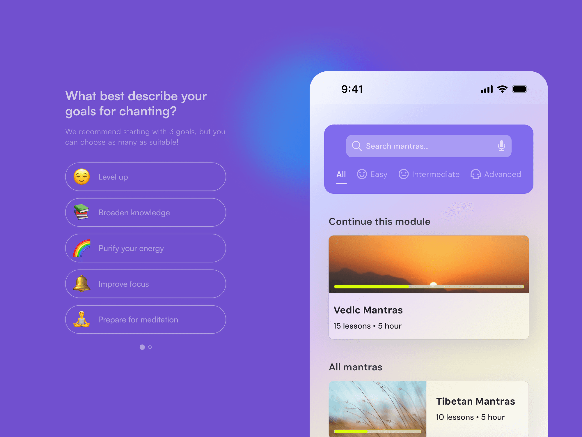
Going into a creation from scratch, I want to deliver a simple yet solving both the knowledge acquisition and maintenance of mantra chanting. Onboarding was one of the main focuses to bring mantra chanting closer to new audience. The feel of the app needs to represent OHM center: calming yet playful.
A living dialog
I wanted to replicate the atmosphere that OHM builds at their center – intimate and conversational – as if the teacher is right here with you. This makes the design feel less technical and more like a person.

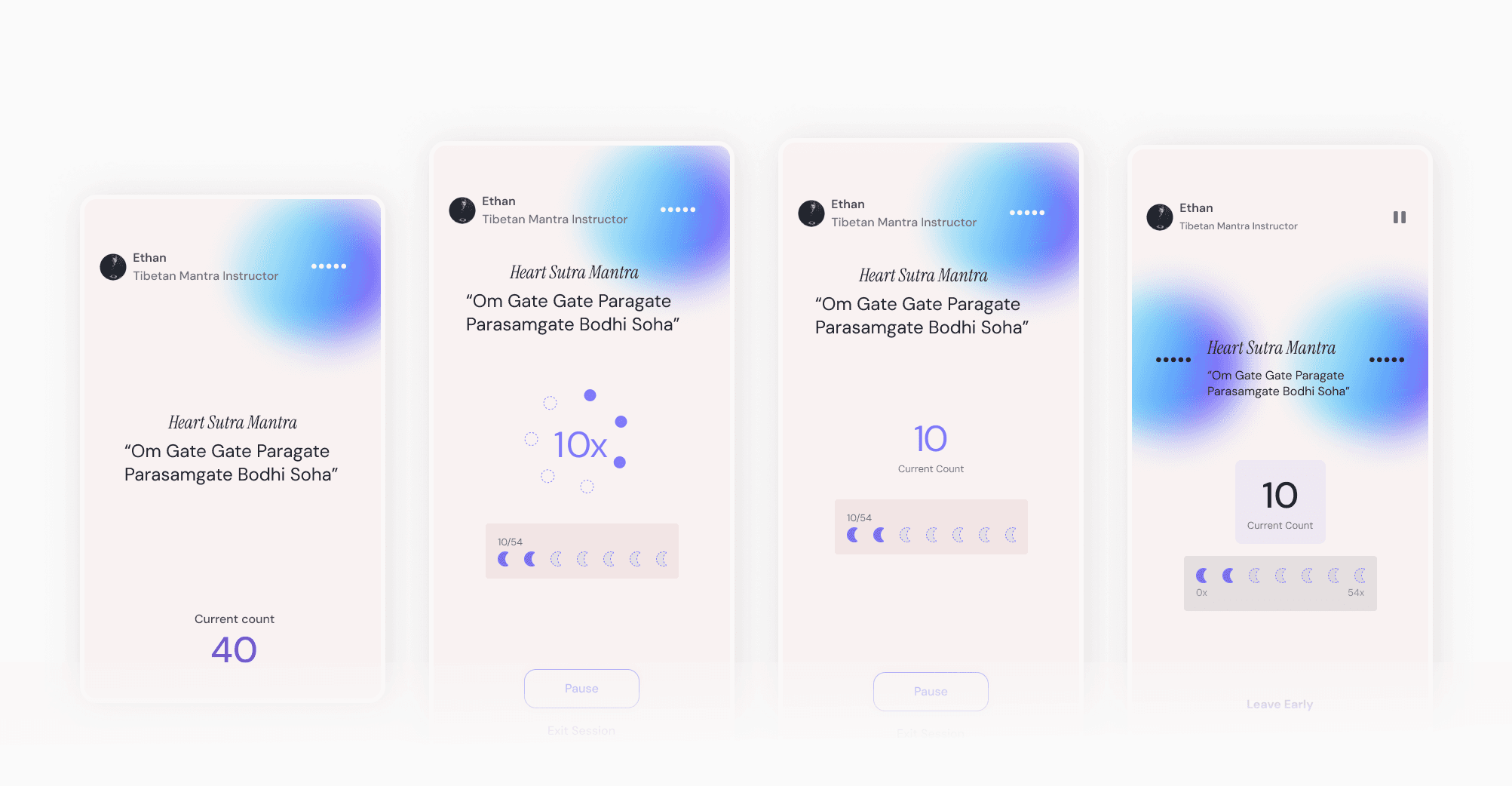
Some iterations on chanting layout. I landed on my final design as I learned that learners prioritize seeing the count only.

Microinteractions sprinkled in every corner of the app to make it fun, delightful and human.
Accessible mantras on-the-spot
OHM mobile application offers an extensive library of 100+ mantras to learn and practice on.

Optimizing chanting sessions
Learners can be flexible about how long the sessions will take. This caters to especially the New York residents who need to optimize their daily time for many hustles but still can dedicate to their chanting practice.


What a ride!
Jumping into a new problem space – one that is as niche as mantra chanting – was a nice challenge for me, especially as a solo designer. Coming out of this project, I learned how to sneak in (even just a little bit of) research in every design step to make sure the outcomes align with our brief. Lots of rethinking moments, and I’m grateful for the team at OHM to have helped me learn and grow as a design along the way!
Increased 87% satisfaction for Civian's data platform | Civian
@Ha Do | last updated apr 2024